
Grand + Nash
Visual Design, Web
2020
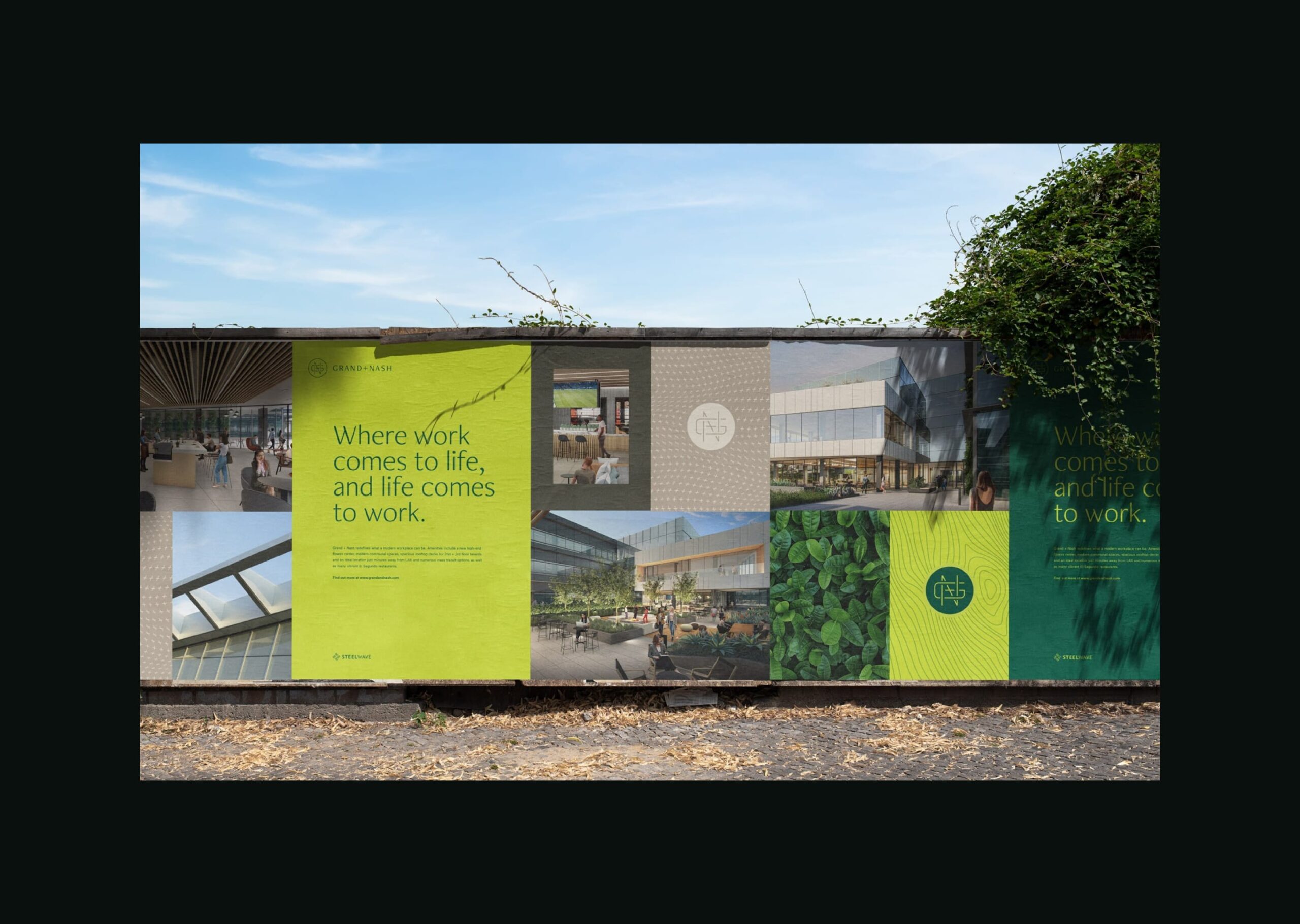
SteelWave, a commercial real estate developer, partnered with HAUS to develop branding and a website for its latest property, Grand + Nash. The property is located in the heart of El Segundo, a beach town that is easily accessible. Grand + Nash is a newly renovated creative workplace that combines lush green space with the convenience of a modern office campus.
Role: Designer
HAUS crafted a new site full of texture and movement, modernizing the appearance of the legacy agency. The redesign also incorporates the aesthetic of a vintage newspaper, tying the agency’s 85-year legacy to the modern era.
Starting with the US headquarters in Chicago; we created an individual country site to be used as a template for other offices. A modular structure was used to build long-form case studies, and we enhanced the news section to be more robust. Country sites also feature auxiliary pages to talk about the agency's process—known as HumanKind—and showcase the clients, people and community actions local to each of Leo Burnett’s international offices.
By incorporating green space design principles with natural materials, lush greenery, and an open layout, we created a website that reflects its environment.
Logo Animation.
HAUS crafted a new site full of texture and movement, modernizing the appearance of the legacy agency. The redesign also incorporates the aesthetic of a vintage newspaper, tying the agency’s 85-year legacy to the modern era.
Starting with the US headquarters in Chicago; we created an individual country site to be used as a template for other offices. A modular structure was used to build long-form case studies, and we enhanced the news section to be more robust. Country sites also feature auxiliary pages to talk about the agency's process—known as HumanKind—and showcase the clients, people and community actions local to each of Leo Burnett’s international offices.
Logo Animation.
Materials.
HAUS crafted a new site full of texture and movement, modernizing the appearance of the legacy agency. The redesign also incorporates the aesthetic of a vintage newspaper, tying the agency’s 85-year legacy to the modern era.
Starting with the US headquarters in Chicago; we created an individual country site to be used as a template for other offices. A modular structure was used to build long-form case studies, and we enhanced the news section to be more robust. Country sites also feature auxiliary pages to talk about the agency's process—known as HumanKind—and showcase the clients, people and community actions local to each of Leo Burnett’s international offices.
Materials.
Amenities.
HAUS crafted a new site full of texture and movement, modernizing the appearance of the legacy agency. The redesign also incorporates the aesthetic of a vintage newspaper, tying the agency’s 85-year legacy to the modern era.
Starting with the US headquarters in Chicago; we created an individual country site to be used as a template for other offices. A modular structure was used to build long-form case studies, and we enhanced the news section to be more robust. Country sites also feature auxiliary pages to talk about the agency's process—known as HumanKind—and showcase the clients, people and community actions local to each of Leo Burnett’s international offices.
Amenities.
Landing.
HAUS crafted a new site full of texture and movement, modernizing the appearance of the legacy agency. The redesign also incorporates the aesthetic of a vintage newspaper, tying the agency’s 85-year legacy to the modern era.
Starting with the US headquarters in Chicago; we created an individual country site to be used as a template for other offices. A modular structure was used to build long-form case studies, and we enhanced the news section to be more robust. Country sites also feature auxiliary pages to talk about the agency's process—known as HumanKind—and showcase the clients, people and community actions local to each of Leo Burnett’s international offices.
Landing.
Sitemap.
HAUS crafted a new site full of texture and movement, modernizing the appearance of the legacy agency. The redesign also incorporates the aesthetic of a vintage newspaper, tying the agency’s 85-year legacy to the modern era.
Starting with the US headquarters in Chicago; we created an individual country site to be used as a template for other offices. A modular structure was used to build long-form case studies, and we enhanced the news section to be more robust. Country sites also feature auxiliary pages to talk about the agency's process—known as HumanKind—and showcase the clients, people and community actions local to each of Leo Burnett’s international offices.
Sitemap.
Typography.
HAUS crafted a new site full of texture and movement, modernizing the appearance of the legacy agency. The redesign also incorporates the aesthetic of a vintage newspaper, tying the agency’s 85-year legacy to the modern era.
Starting with the US headquarters in Chicago; we created an individual country site to be used as a template for other offices. A modular structure was used to build long-form case studies, and we enhanced the news section to be more robust. Country sites also feature auxiliary pages to talk about the agency's process—known as HumanKind—and showcase the clients, people and community actions local to each of Leo Burnett’s international offices.
Typography.
Patterns.
HAUS crafted a new site full of texture and movement, modernizing the appearance of the legacy agency. The redesign also incorporates the aesthetic of a vintage newspaper, tying the agency’s 85-year legacy to the modern era.
Starting with the US headquarters in Chicago; we created an individual country site to be used as a template for other offices. A modular structure was used to build long-form case studies, and we enhanced the news section to be more robust. Country sites also feature auxiliary pages to talk about the agency's process—known as HumanKind—and showcase the clients, people and community actions local to each of Leo Burnett’s international offices.
Patterns.
Marketing Collateral.
HAUS crafted a new site full of texture and movement, modernizing the appearance of the legacy agency. The redesign also incorporates the aesthetic of a vintage newspaper, tying the agency’s 85-year legacy to the modern era.
Starting with the US headquarters in Chicago; we created an individual country site to be used as a template for other offices. A modular structure was used to build long-form case studies, and we enhanced the news section to be more robust. Country sites also feature auxiliary pages to talk about the agency's process—known as HumanKind—and showcase the clients, people and community actions local to each of Leo Burnett’s international offices.
Marketing Collateral.
2024. info@mattbenkert.com